Capital Wines
Wine Importer in the US

Brief
Capital Wines is a well-known company in Washington DC that deals with the research, selection and import of fine Italian wines into the United States.
For this project, the client asked that we create the logo, the website, the corporate identity and a high-level photo shoot to develop the content to be used later on the various platforms. We started from the creation of the logo and from here we developed the entire corporate identity, from the coordinating image, to the site and its applications and finally we dealt with the photoshoot. The shots taken were then included in the main online platforms, on the website and in sector magazines and blogs.
- Customer
- Boxmistral
- Date
- 03-03-2015
- Website
- www.capitalwinesllc.com
Logo
The logo was born from a careful study of the values that Capital Wines wants to convey to its customers.
The initial "C" was created by combining a circle, synonymous with perfection and precision with the shape of a glass of wine to symbolize the company's product sector.
Voluntarily the "W" was created with a font with soft and sinuous shapes to give the idea of a liquid, the wine.
The font chosen for the CAPITALWINES logo is deliberately linear and geometric to emphasize the concepts of quality and solidity of the company.
Overall, a logo that attracts for simplicity, immediacy and precision. Essential characteristics for a company with strong growth ambitions and a strongly innovative, modern and international spirit.
Company Coordinated
The corporate graphics highlights the values and professionalism of the company and highlights the quality of the product by consolidating its brand.


Website
The website has a drop-down menu with several sections in which producers, types of wine, distributors, retailers and finally events are listed. A page is entirely dedicated to the company with the aim of making it known, retaining customers and finding new ones.
Applications
After creating the logo we dealt with its various applications to create and customize the labels, the sub glasses, thus strengthening and spreading the image of the brand.

“A shortened list that wants exactly what you sell is better than a full-bodied list that has no interest.”

Photoshoot
The photo service put in place tells through the images of the soul of the company and its wine products, thus producing real photographs suggestive, which arouse emotions and invite the customer when purchasing the product.
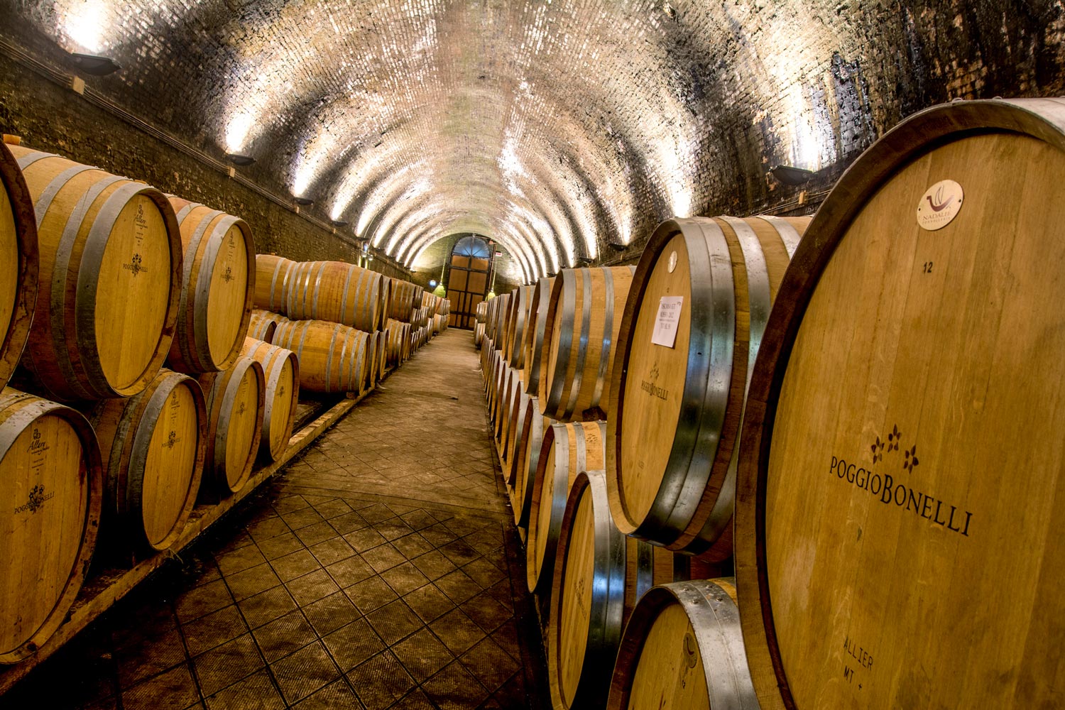

Photo Reportage
To tell the story of the company we opted for the creation of a photo reportage made of emotional images and descriptive texts highlighting the commitment, passion and dedication that the highly professional staff and qualified dedicates every day to their work.
Still-life Photo
To give visibility, importance and value to the company, we have created a photoshoot still-life of wine bottles by combining lights and creativity with an excellent result.
